

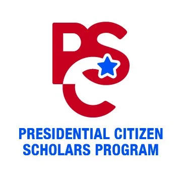


The Presidential Citizen Scholarship Program, a branch off of Salisbury University’s PACE Initiative, was in need of a logo. They wanted the logo to tie into PACE’s, but still have its own unique look. The logos below were from round 1 revisions. The final design incorporates the star from PACE’s logo but gives PCS their own type face & color system to set them apart.


ShoreCorps, another branch of PACE, also wanted a logo with their own unique look that tied in with AmeriCorps. The logos below are from the 1st round of revisions. The final logo incorporates the American flag, the Salisbury seagull, and an open book.


Food For the Flock was the final initiative that needed a new logo. The client wanted something that visually represented the initiative’s purpose, partnered with a visual representation of the “flock”. The final logo uses Salisbury University’s colors & a seagull. The commonly used restaurant branded colors paired with the sun cut-out in the top of the circle are meant to bring the idea of food to mind, like a bite out of a cookie.


